
Themes & Rendering
Themes & Rendering
Content should have a clear identity of its own. Its presentation should be just as deliberate.
A good publishing system has to solve a problem that is easy to underestimate: the same information must remain meaningful while appearing in very different places. An article might be read on a phone, encountered in a list of recent Posts, or opened as a full page. A permanent Page needs room for its own hierarchy and navigation. An image or table should not demand a new layout decision every time an editor uses one.
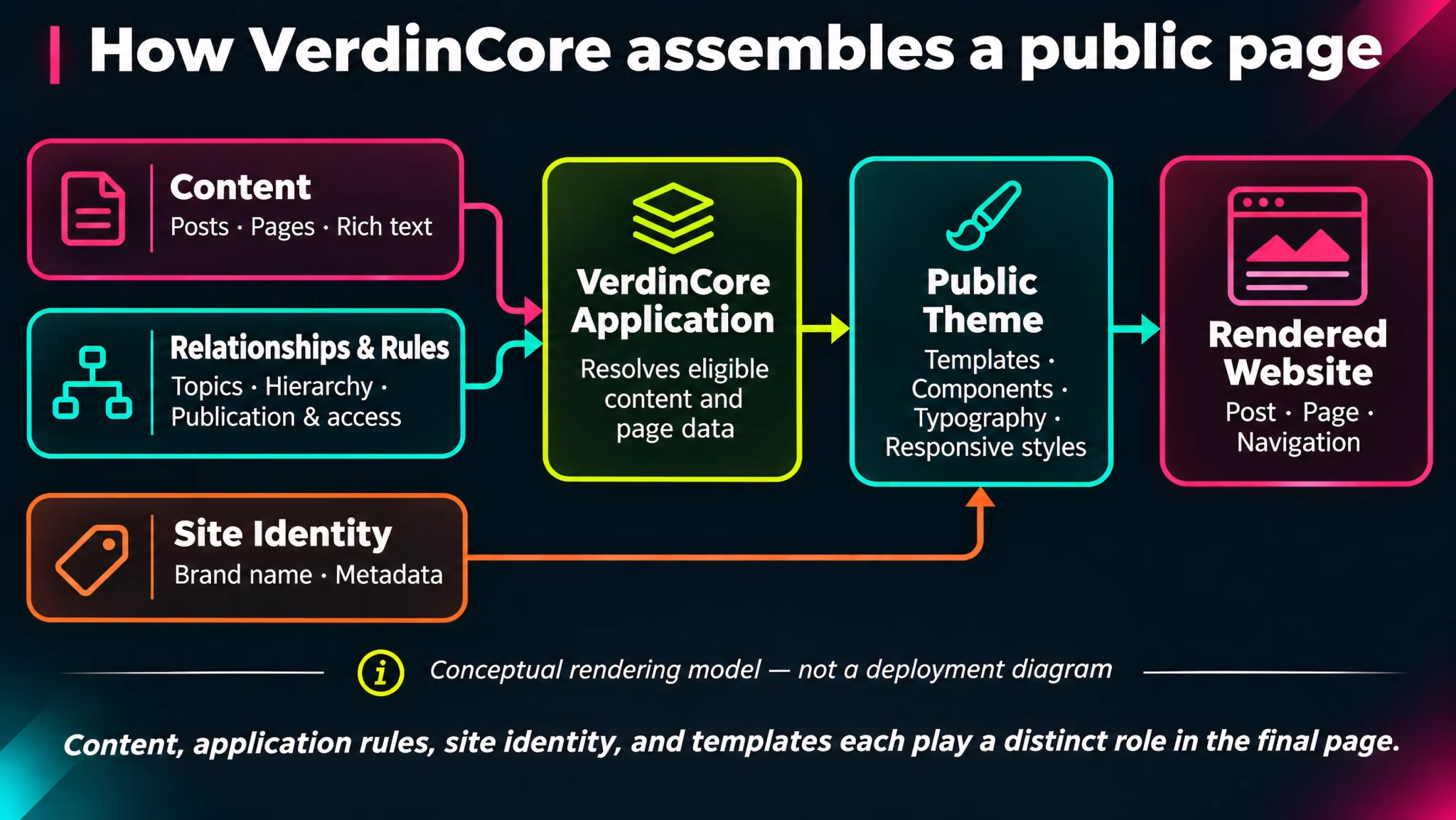
VerdinCore approaches this through server-rendered templates and a dedicated public theme. Editors create and organize content; the application resolves what should be displayed; the theme determines how that content is presented. It is a practical separation, intended to keep routine publishing from becoming routine web design.
Content and presentation have different jobs
A Post is more than the HTML in its body. It has a title, publication state, metadata, an optional featured image, and potentially Topics. A Page has a different role: it can belong to a hierarchy, contribute to breadcrumbs, and introduce child pages.
Those relationships belong to the content system. They should not have to be recreated manually inside every article.
The public theme takes that structured information and gives it a consistent visual context:
Responsibility | Managed by | Example |
|---|---|---|
Editorial content | Content management and the visual editor | Headings, paragraphs, images, tables, and the text of a Post or Page. |
Content relationships | The application | Assigned Topics, parent Pages, publication state, and access rules. |
Page composition | Public templates and components | A Post header, featured image, reading area, navigation, or a child-page section. |
Visual language | Theme styles and assets | Typography, spacing, color, responsive layout, and the treatment of editorial elements. |
Site identity | Brand configuration | Site name, slogan, contact details, and configured social links. |
This arrangement gives editors a stable way to work while leaving presentation decisions where they belong. It also makes the distinction between changing an article and changing the site's design much clearer.
Different content deserves different presentation
Posts and Pages share an editing foundation, but their public presentation serves different needs.
Posts: a reading experience
In the public theme included in the reviewed codebase, a Post page brings together its title, optional Topic links, featured image, publication details, and the article body. When enabled and applicable, related-content components help readers discover another relevant piece after finishing the current one.
The writing remains the center of the page. Navigation and supporting information belong around it, rather than being embedded by the author in every new article.
((Screenshot from the public website: Open a representative published Post containing a strong title, a featured image, several paragraphs, and at least one formatted element such as a figure with a caption or a table. Capture the upper article and the start of the reading area at approximately 1440 × 1000 desktop resolution. Include visible Topic links only if the site's Topics feature is enabled. Do not use a draft or reveal private editorial controls. Place after "Posts: a reading experience". Suggested caption: "A published Post combines editorial content with a consistent reading layout."))
Pages: information with a place in the site
A Page can be part of a parent–child structure. The public rendering can reflect that relationship through its URL path, breadcrumbs, and a section linking to direct child pages.
The supplied theme also treats Page headers differently from Post headers, including a distinct presentation for featured Page imagery. That is an intentional distinction between ongoing editorial publishing and more permanent site information, not a requirement for editors to design two separate page formats by hand.
((Screenshot from the public website: Open a published Page that belongs to a visible hierarchy and has at least one direct published child Page. Frame the Page title and breadcrumb trail clearly; if possible include the beginning of the Page content. Use a second, shorter crop of its "In this section" / child-page area only if it cannot reasonably fit in the first image. Aim for roughly 1440 × 900 for the main screenshot. Hide admin-only edit links or account information. Place after "Pages: information with a place in the site". Suggested caption: "Page hierarchy can become visible navigation without manually rebuilding it in the editor."))
These are examples of the current implemented public theme. They illustrate the rendering model; they are not promises that every future theme will use identical layouts.
The theme gives rich content a consistent visual language
Writing with a rich-text editor creates structure. The published website still needs to make that structure readable.
VerdinCore's public theme includes presentation rules for editorial content such as:
Headings and paragraphs, with distinct typography for long-form reading.
Images and captions, with figure styling that adapts to the available width.
Tables, including a horizontally scrollable treatment when their width exceeds the reading area.
Embedded video, with responsive framing within the content layout.
Code blocks, with dedicated styling and conditional loading of syntax-highlighting assets on Post and Page views when applicable.
These choices matter most when content becomes complicated. A wide table should remain usable on a smaller screen; a caption should look like a caption, not an improvised paragraph; and a code example should be distinguishable from ordinary prose.
The editor defines the content. The theme gives that content a coherent home.
This is also why a visual editor and a public theme are not interchangeable. The editor helps an author create a document; the theme shapes the finished reading experience. The two should work together without forcing every author to become a frontend developer.
For the authoring tools themselves, see The Visual Editor, Tables & Embeds, and Images & Media.
Reusable components keep site-wide elements consistent
Not every piece of a page belongs to its article body. Navigation, social links, featured content, and lists of child pages are site-level concerns.
The rendering layer uses shared components to assemble these areas. That means a navigation component can use the current Page hierarchy, for example, rather than requiring editors to duplicate the same links in the body of several Pages.
There is a second kind of reuse: Content Blocks. These are managed collections of typed values, such as text, rich text, links, and images. A template can request the values it needs and decide how to present them. This allows selected site content to be updated without making its visual structure editable on every occasion.
There is a deliberate boundary here:
Site component | Reusable Content Block |
|---|---|
Defines or renders a part of the website's interface. | Supplies managed values that a template may display. |
Can gather data such as navigation items or related Posts. | Holds typed content such as text, links, or images. |
Its structure and visual behavior are determined by theme/application code. | Its placement and final appearance are determined by the consuming template. |
Content Blocks are not drag-and-drop layout blocks. Adding one does not automatically place a new section on a public Page. The template must be designed to use it.
See Reusable Content Blocks for the editorial side of this capability.
Brand identity is not the same as a theme
VerdinCore keeps site identity separate from its public presentation. Configuration can provide a site's display name, slogan, contact information, social profiles, and relevant identity metadata. The theme determines how those values are used visually.
That distinction is useful even for a single website: changing a social link or site label is not the same operation as redesigning a header. It also supports the broader practice of applying a consistent CMS foundation to websites with different identities.
It would be inaccurate, however, to describe this as a multitenant site builder. The source demonstrates configured site identities and theme selection at the application/deployment level, not an administration screen for switching between arbitrary downloadable themes or managing many independent customer websites in one installation.
The distinction matters because a capability is more credible when its actual scope is clear.
Rendering on the server, with targeted frontend behavior
VerdinCore builds public pages on the server using PHP and CodeIgniter views. The theme supplies layouts, page templates, reusable view components, styles, and JavaScript assets.
The current frontend uses Tailwind CSS 4, DaisyUI 5, and an esbuild asset pipeline. The administration interface and the public theme have their own asset entries, allowing each side of the product to serve its different purpose.
For a visitor, the important result is straightforward: the article's title, body, navigation, and associated metadata are assembled as a server-rendered page. JavaScript can then enhance specific interactions where it is needed. The public site is not dependent on an advertised headless API or a client-side application shell to display an ordinary Post or Page.
Rendering is also where editorial decisions become visible to readers. Publication state and access checks determine which content may be served; the theme handles the permitted content's presentation. Separately generated metadata supports search engines and social sharing, without requiring an author to build that markup inside the article.
For the broader system perspective, see Architecture Overview and SEO & Distribution.
Deliberate design, not unlimited customization
VerdinCore is not trying to make every visual decision an editor setting.
Some choices should remain under the control of the site's design: reading widths, navigation structure, consistent figure styles, responsive behavior, and the way a Page or Post is composed. Other choices belong to the author: what to write, how to organize a document, which image to use, and when to publish it.
Keeping those responsibilities distinct provides two advantages. Authors spend less time repeating design work, and the website has a better chance of remaining visually consistent as content grows.
The theme architecture is a foundation for deliberate presentation, not a claim of unlimited no-code customization, a public theme marketplace, or automatic compatibility with arbitrary third-party templates.
The goal is not to expose every design choice. It is to make the right design choices once, so that publishing can happen many times.