
Reusable Content Blocks
Reusable Content Blocks
Not every piece of website content belongs in a Post or a Page.
A homepage introduction, a promotional message, a recurring call to action, or a small piece of information in the footer may need to change without changing the surrounding layout. Treating every such update as a template-editing task creates unnecessary friction. Copying the same text into several places creates another problem: keeping those copies consistent.
VerdinCore addresses this with Content Blocks: structured pieces of content managed separately from Posts and Pages, ready to be used by the site's templates.
The idea is deliberately restrained. Editors manage the information; the template determines how and where it appears.
Content without an entire page around it
A Post is a publication. A Page provides a destination with its own URL and place in the site's structure. A Content Block serves a different purpose: supplying a defined set of values to a part of the website.
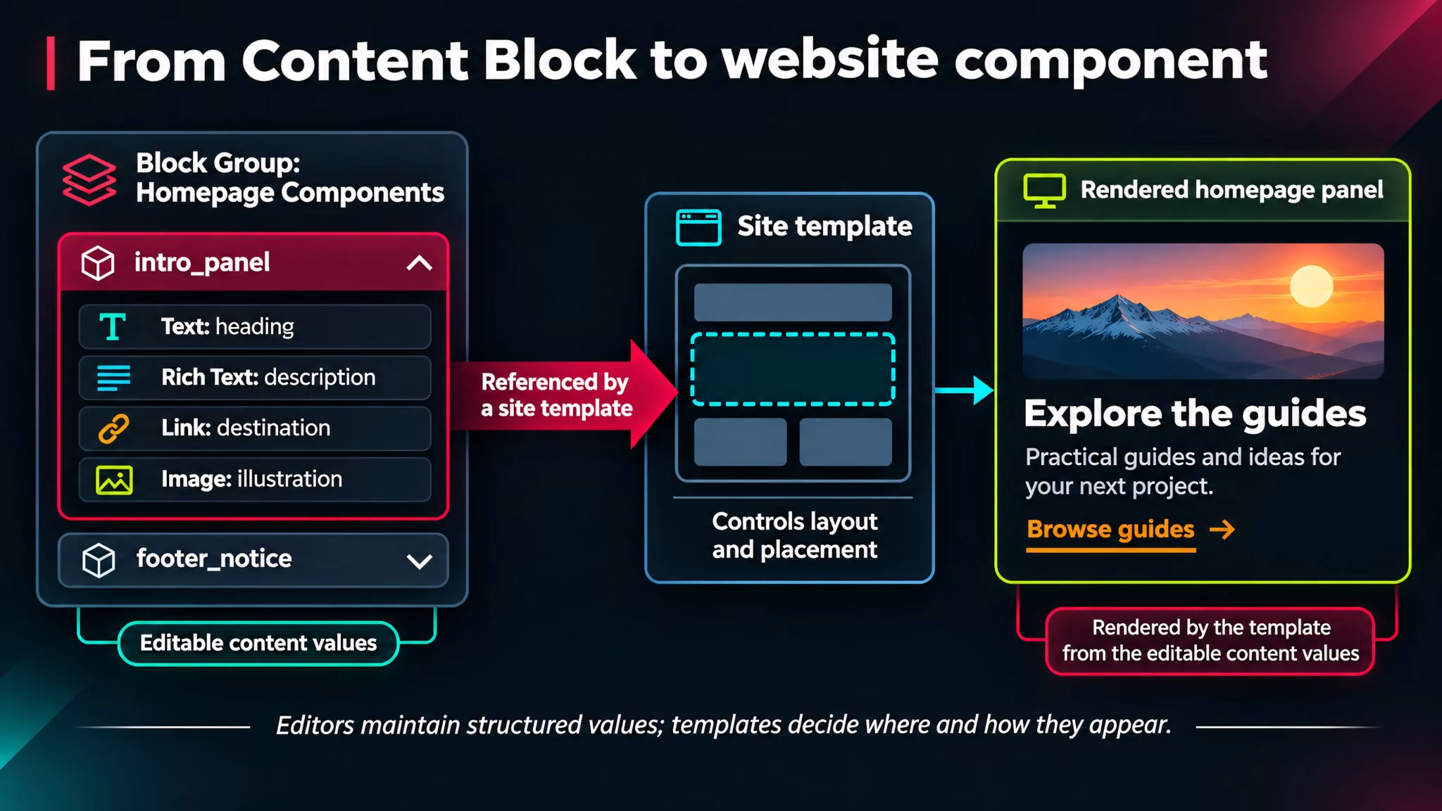
Consider a homepage panel introducing a new section of a site. Its design might include a heading, a short description, a button, and an illustration. None of those values necessarily needs an independent Page, and changing the message should not require editing the template's markup.
A Content Block can hold those values together while leaving the panel's layout under the control of the theme.
Content need | More appropriate place | Why |
|---|---|---|
A full article or announcement | Post | It belongs in the publishing flow and can be discovered as an individual publication. |
A lasting information destination | Page | It has its own URL and can participate in the page hierarchy. |
Text, links, or imagery used by a specific site component | Content Block | The content is managed independently of the component's presentation. |
This distinction is not about creating three ways to do the same thing. It is about giving different kinds of information an appropriate home.
How Content Blocks are organized
VerdinCore uses a simple three-level structure:
Block Groups collect related blocks under a descriptive name.
Blocks represent individual content units within those groups.
Elements hold the actual values that a template can use.
Each group and block has a stable identifier, or handle, so content can be referenced by the site's implementation without relying on its position in a list. Blocks also support an optional description, useful for explaining their intended purpose to the people managing them.
In the administration dashboard, the Blocks screen lists existing blocks with their group, number of elements, description, and creation and update dates. Administrators can filter the list by group and change its sort order.
((Screenshot from VerdinCore Admin > Dashboard > Blocks: prepare two or three clearly named demonstration Block Groups with several Blocks, then capture the Blocks list. Show the “Block Group” and “Sort Order” filters, the Handle, Group, Elements, and Description columns, and the “Add Block” and “Block Groups” controls. Use a desktop frame around 1600 × 950. Hide private names and operational identifiers. Suggested caption: “The Blocks dashboard keeps reusable content organized independently of Posts and Pages.”))
Four element types, each with a purpose
A Block is assembled from the element types currently supported by the management interface:
Element | Stores | Typical use |
|---|---|---|
Text | Plain text | A heading, short label, or brief message |
Link | A URL or link destination | A button or navigational action |
Rich Text | Formatted text | A longer description that benefits from basic formatting |
Image | A managed image asset | An illustration or visual identity element |
These types keep the content understandable. A heading is not a mystery HTML fragment; a link is not buried inside an unrelated settings field. The person working with the block can see the kind of information each element represents.
For Rich Text, the dashboard provides a compact editing experience. Images have their own upload workflow, with the supplied file retained for the block rather than automatically treated as a featured Post or Page image.
((Screenshot from VerdinCore Admin > Dashboard > Blocks > Add Block, or Edit an existing demonstration Block: select a group such as “Homepage Components” and a block such as “intro_panel”. Populate elements for a heading (Text), explanatory copy (Rich Text), a button label (Text), a destination (Link), and an illustration (Image). Frame the modal so the group, handle, description, four “Add element” buttons, and several populated elements are readable. Capture at approximately 1600 × 1000 or as two overlapping screenshots if needed. Use fictional product content and a non-sensitive image. Suggested caption: “A Content Block combines typed values while leaving their visual arrangement to the website.”))
A practical example: one homepage message
Imagine a small panel on the homepage introducing a collection of technical guides. The template already knows where to position the panel and how to style its heading, body text, illustration, and link.
The content could be modeled as follows:
Element | Type | Example value |
|---|---|---|
| Text | Explore the technical guides |
| Rich Text | Practical explanations of the tools and decisions behind the platform. |
| Text | Browse guides |
| Link |
|
| Image | A selected guide illustration |
This is an illustrative content structure, not a claim that VerdinCore ships with a predefined “homepage message” component.
Once the template has been designed to use these values, the content can be changed in the Blocks dashboard without altering that template's layout. The heading may change, the link can point somewhere else, or the illustration can be replaced, while the component retains its intended appearance.
That division of responsibility is the principal benefit: the structure remains deliberate; the content remains editable.
((Screenshot from a real VerdinCore-powered website showing a component actually connected to a demonstration Content Block, ideally the homepage panel described above. Show the entire rendered component and a little surrounding page context at approximately 1440 × 850. Capture this only after verifying that the active site template uses the block; if no connected component exists yet, omit this image rather than presenting a mockup as implemented functionality. Suggested caption: “A template can present managed Block content inside a consistent website component.”))
Reuse is intentional, not automatic
The word reusable deserves a precise explanation.
Content Blocks make the same managed values available to one or more places that are designed to use them. This is useful for shared messages or elements whose text needs to be maintained centrally. But creating a Block does not automatically place it on a website, insert it into every article, or generate a new page component.
The site template has to reference the appropriate content. This is a design-time connection, not a drag-and-drop page-building interface for arbitrary layouts.
That is also why Content Blocks should not be confused with the blocks inside the visual editor. A paragraph, table, image, or embed in an article belongs to that document. A reusable Content Block is stored and managed separately, for a template-defined purpose.
Reuse works best when content can change without forcing the design to change with it.
Why separate content from presentation?
This is a small architectural decision with practical consequences.
For content managers, it creates a dedicated place to update supporting website information rather than searching through templates or duplicating content across Pages.
For designers and site implementers, it preserves control over layout. The same content fields can be presented in a carefully designed component without giving every editor responsibility for spacing, markup, or responsive behavior.
For the website over time, it reduces the temptation to solve every new content request with a hardcoded string or a one-off Page. A component can keep doing the same job while its message evolves.
There are boundaries, and they are worth keeping. Content Blocks are not a substitute for a complete publishing workflow, and the current implementation should not be described as a visual page builder, a versioned component library, or a system that automatically distributes content without template integration.
A focused tool for recurring content
The strongest feature of Content Blocks is not an unlimited collection of field types. It is the clear separation of concerns:
Posts and Pages carry the site's authored publications and destinations.
Content Blocks carry structured values for specific website components.
Templates decide how those values become part of the public experience.
This gives VerdinCore another way to handle everyday publishing needs without turning the main editor into an all-purpose site-design tool.
Continue exploring: Posts & Pages · The Visual Editor · Images & Media